Learn how to get the most out of every feature. Whether you're analyzing a reference or mixing paint, these guides will help you work faster and more accurately.
Note: This guide covers the full Color Study app. Not all features are available in the web version.
Canvas
Best for
Exploring your reference, customizing the view
Use when
Navigating around the image, adjusting how colors are displayed
Quick start
Pinch to zoom → Tap swatches to locate → Customize in Display menu
Navigating the Canvas
Pinch to zoom and drag to pan around your image.
Double-tap the canvas or use the fit-to-screen button to center and fit the image.
Tap a swatch in your palette to highlight its location on the image.
Double-tap a swatch to center the image on that color's location.
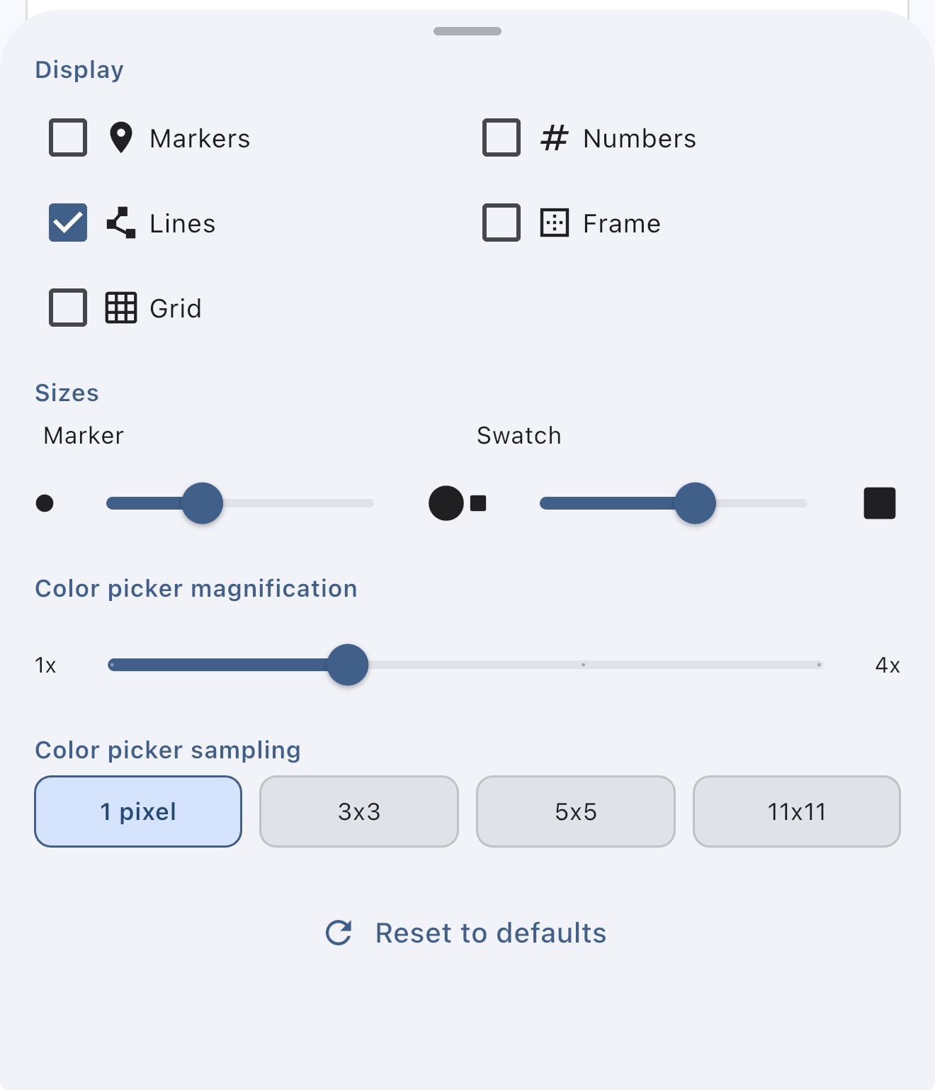
Display Options
Customize how your color picks appear via the Display menu:
Show/hide markers on the image itself, or display them only in the palette.
Toggle numbers on markers and swatches for easy reference.
Enable connecting lines to draw lines from each palette swatch to its corresponding point on the image.
Frame mode distributes swatches around a frame surrounding your image, placing each color closer to where it was picked.
Bottom Panel
In Normal View, the bottom panel shows color information and your palette. In analysis views (Values, Simplify, Notan, Temperature), it shows the controls for that view.
Drag the handle at the top of the panel to resize it — make it taller for more room or shorter to see more of your image.
Tap the handle to collapse the panel completely, freeing up the full screen for your image. Tap again to expand it back to its default size.
Double-tap the canvas after resizing to refit the image to the available space. If the image is already fit to screen, resizing the panel automatically refits the image for you.
Your panel size is remembered per view mode, so you can have the Values panel tall and the Notan panel collapsed, for example.
View Mode Thumbnails
The row of thumbnail previews above the view tabs shows a live preview of what your image looks like in each analysis mode. Tap a thumbnail to switch to that view. Tap the handle below the thumbnails to toggle between full previews and compact icons. You can also drag the handle to resize the previews continuously.
Building a color palette, understanding your reference
Use when
Starting any new painting or study
Quick start
Load image → Tap eyedropper → Pick key colors
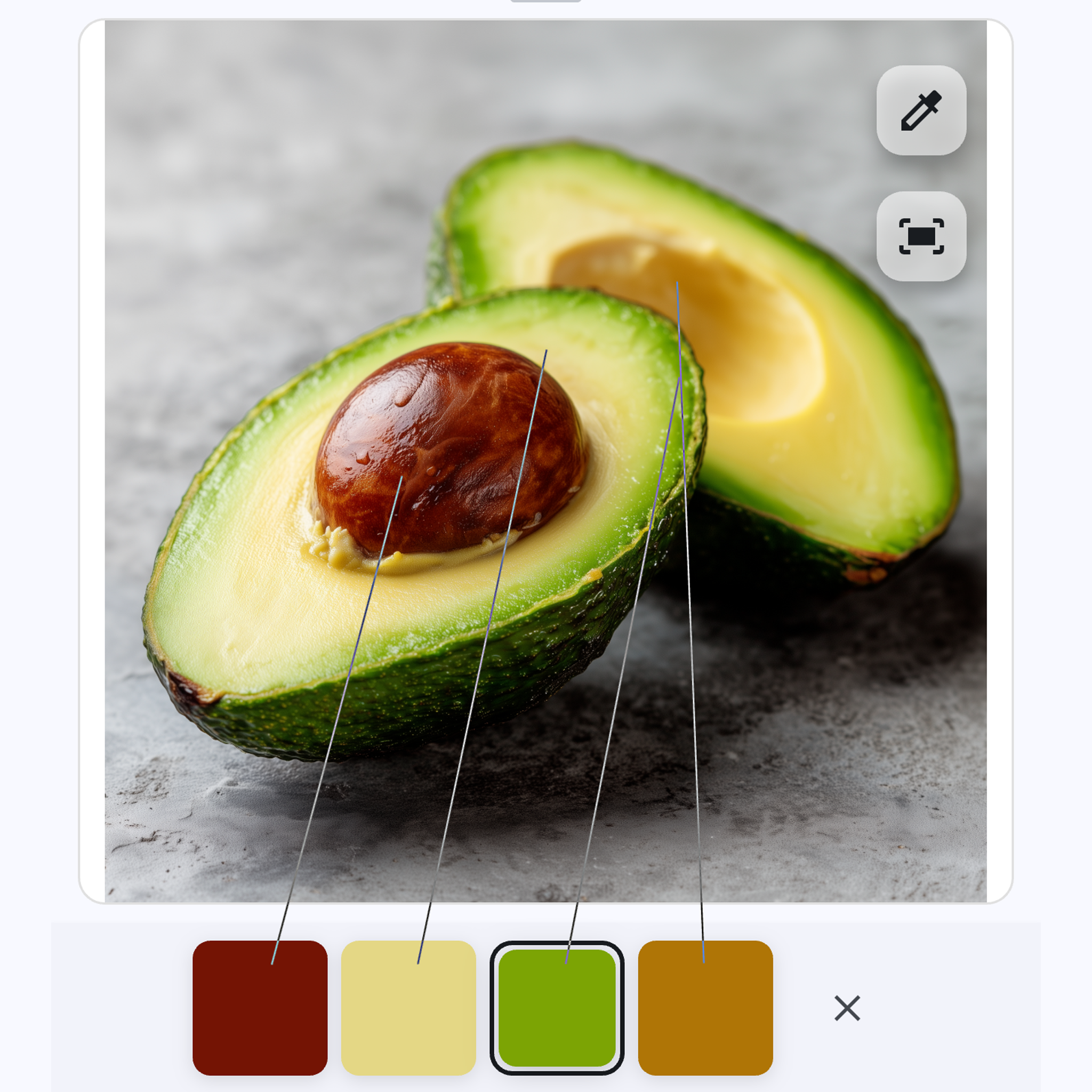
Normal View is your home base for exploring colors in any reference image. Pick colors manually, extract them automatically, and build a palette that maps back to your image.
Tap the eyedropper to bring up a draggable magnifier. Tap to pick, or drag it around to explore, then release on the color you want.
Long-press anywhere as a shortcut — the magnifier appears and you can drag to your target, then release to pick.
Adjust magnification in the Display menu to zoom in closer for precision work.
Change sample size in the Display menu to average colors from a larger area — helpful for textured surfaces where individual pixels vary.
Quickly understanding color distribution in your reference
Use when
Starting a new painting, building an initial palette
Quick start
Tap magic wand → Choose Dominant/Range/Accents → Add colors
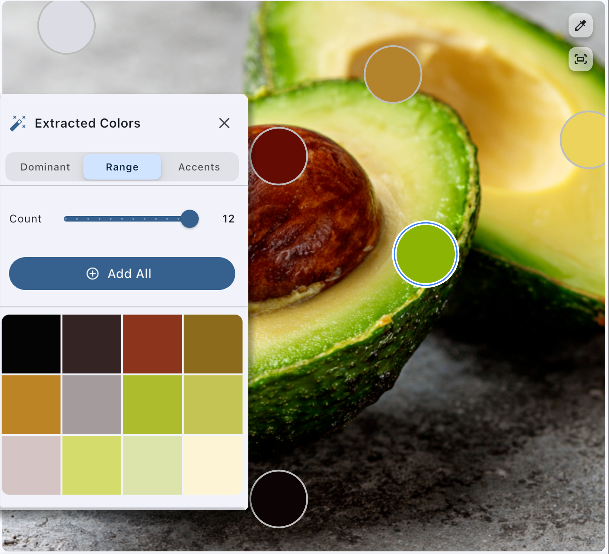
Tap the magic wand to open the extracted colors dialog. Three categories help you quickly understand your image:
Dominant — The most common colors in your image, listed by percentage in descending order.
Range — Sample colors spanning the entire brightness spectrum from dark to light.
Accents — Distinct, unique colors that stand out from the rest.
Tap individual colors to add them to your palette, or hit Add All to add them all at once. Use the slider to adjust how many colors are extracted. You can enable auto-extraction on the dialog itself to show it automatically whenever you load an image.
Tip: Start by picking colors from your lightest light, darkest dark, and a few key midtones. These anchor points help you understand the full range of your reference before diving into details.
Understanding color relationships, planning transitions
Use when
Mixing paint, checking shadow/light relationships
Quick start
Select color → Tap Details or Compare
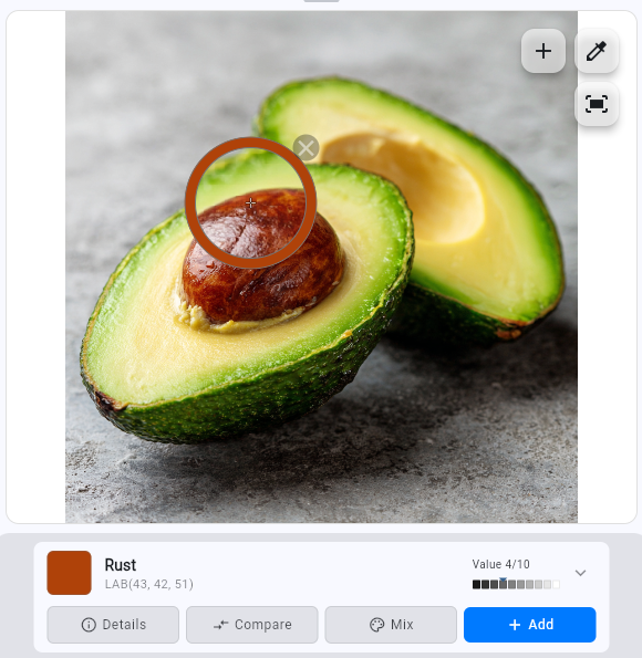
When you select a color, the color info card gives you everything you need to understand and work with that color.
The Color Card
Each selected color shows a card with four options:
Details — View comprehensive information: value, hue, saturation, color temperature, complementary color, and color codes (HEX, RGB, etc.).
Compare — Select another color to see the relationship between them.
Mix — Jump to paint mixing with this color as your target.
+Add — Add this color to your palette (same as the + button on the canvas).
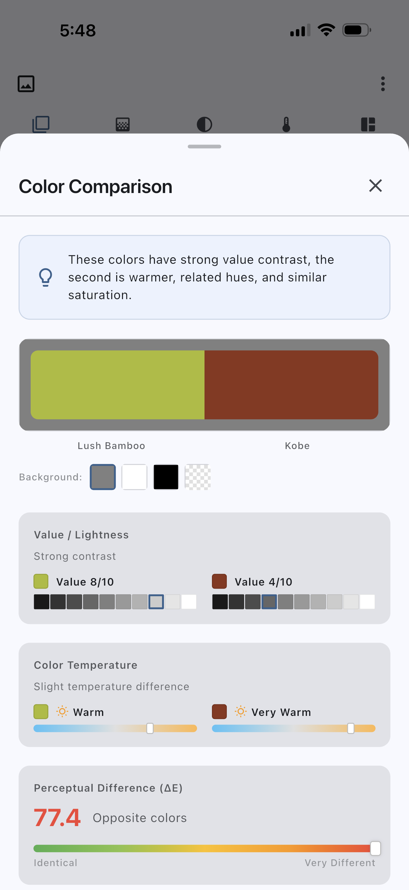
Comparing Colors
Tap Compare on any color card, then choose a second color:
Select from your existing palette
Pick a new color from the image
Choose an arbitrary color from the color picker
The comparison shows relative differences in value, temperature, hue, and saturation — exactly what you need to mix accurate transitions.
This is especially useful for judging relative brightness and temperature between colors. Whether comparing colors close together or across the image, it's often hard to judge colors in an absolute sense due to optical illusions and color relativity. Compare gives you the objective relationship.
Tip: Use Compare to check relationships between shadow and light colors, or to see how an accent color differs from its surroundings.
Planning palette, checking if shadows read correctly
Quick start
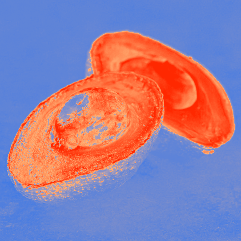
Go to Temp → Adjust balance → Note warm/cool patterns
The temperature map visualizes warm and cool areas — orange for warm, blue for cool — helping you see temperature relationships that might be subtle in the original.
Controls
Balance slider — Adjust the threshold between warm and cool. Shift it to see how temperature relationships change across your image.
Smoothing — Pre-smooth for cleaner temperature regions.
Hold the image button to compare with the original.
Tip: In natural light, warm light typically creates cool shadows, and cool light creates warm shadows. Check if your reference follows this pattern — it's a key to believable color.
Seeing where a color appears across your reference
Use when
Checking color repetition, understanding color distribution
Quick start
Pick a color → Tap Highlight → Adjust tolerance → Switch display mode
Tap the Highlight button on any selected color to find every pixel in your image that closely matches it. This works in both Normal View and Simplified Shapes view.
Controls
Tolerance slider — Drag toward "more" to include a broader range of similar colors, or toward "fewer" for a tighter match. A histogram behind the slider shows how pixels are distributed across the tolerance range.
Highlight / Outline — Toggle between two display modes. Highlight overlays matching areas in gold and dims the rest to grayscale. Outline shows only animated marching ants along the edges of matching areas, leaving the image untouched.
Color swatches — Tap any swatch in your palette to switch which color is being highlighted. The app remembers your tolerance setting for each color.
Long-press the Highlight button for a quick preview without opening the controls.
Tip: Use Highlight to check how a shadow color repeats across your painting — you might find it appears in unexpected places, helping you unify your color strategy.
Before starting, evaluating if a reference will work
Quick start
Go to Notan → Adjust threshold → Look for strong interlocking shapes
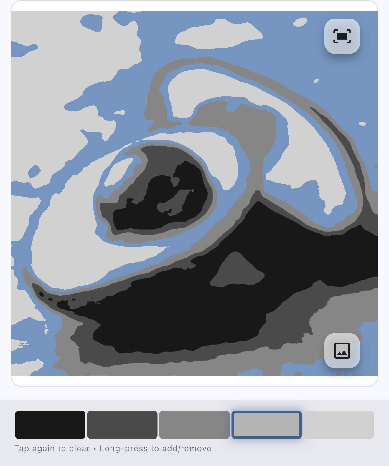
Notan reduces your image to just two values — black and white — revealing the fundamental composition and value pattern.
Controls
Balance slider — Adjust where the light/dark division falls. The default is calculated automatically based on the median luminance of your image. Drag left to group more midtones with the lights, or right to group them with the darks.
Smoothing — Pre-smooth for cleaner shapes.
Invert — Flip black and white to see the pattern from a different perspective.
Hold the image button to compare with the original.
Tip: Notan is Japanese for "light-dark harmony." A strong notan has interesting interlocking shapes. If the notan looks weak or confusing, the composition may need adjustment before you start painting.
Creating line art references, tracing guides, underdrawings
Use when
Transferring a drawing to canvas, studying edges and form
Quick start
Go to Simplify → Tap Drawing tab → Choose Sketch or Contours → Adjust sliders
The Drawing tab generates different styles of line art from your reference image to analyze and guide drawing.
Sketch
Sketch produces detailed, artistic pencil-sketch-style line art. It captures finer details and textures across the image — ideal for expressive underdrawings or studying the full range of forms in your reference.
Contours
Contours produces clean edge lines that highlight major boundaries and structure. It focuses on the big shapes and contours rather than fine detail — useful for understanding the underlying structure of your composition.
Controls
Line slider (Light ↔ Dark) — Adjust line darkness from faint gray to solid black.
Stroke slider (Thin ↔ Thick) — Adjust line weight from delicate to bold.
Invert — Flip to white lines on a black background.
Sliders update live as you drag, so you can dial in the look you want in real time.
Tip: Try exporting a Contours drawing as a structural guide for your initial lay-in, then switch to Sketch for a more detailed reference as your painting progresses.
Starting a painting, feeling overwhelmed by detail
Quick start
Go to Simplify → Adjust Details slider → Export or Open in Normal View
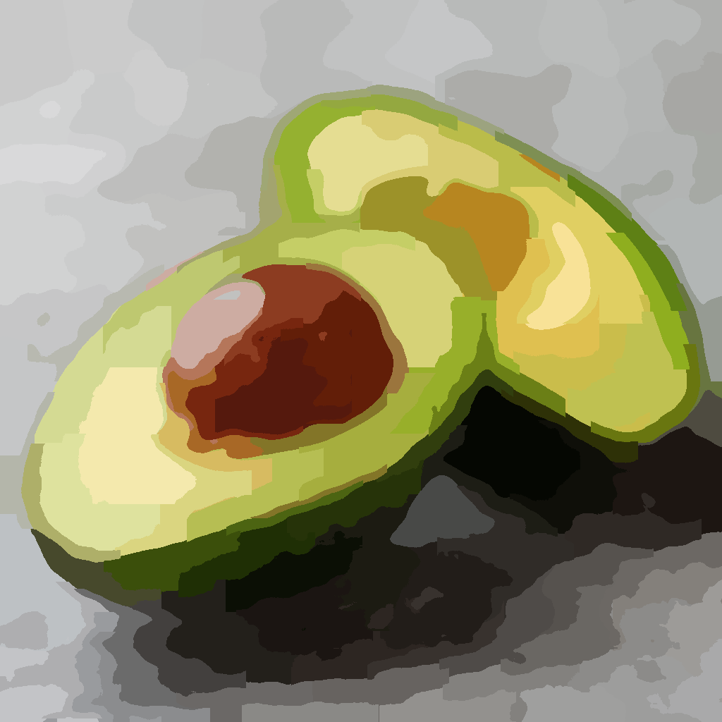
Simplification reduces overwhelming detail into clear, paintable shapes. It's like squinting at your reference, but with precise control.
Controls
Details slider — Move left for fewer details (bigger shapes), right for more detail.
Smoothing — Apply None, Subtle, or Strong pre-smoothing to soften edges and create cleaner forms before simplification.
Simplification Methods
Clustering (default) — Groups similar colors into distinct regions. A reliable all-around method that produces nice paintable masses.
Graph — Finds natural edges and boundaries in the image. Takes a bit longer to process, and may retain some edges that Clustering doesn't. Good for images with strong contours.
Posterize — Reduces colors to discrete levels for a poster-like effect.
Unlike other apps that simply blur your image, our simplification creates clean, paintable shapes with clear boundaries between color masses — exactly what you need for blocking in.
Working with Simplified Images
Use the color picker to see what colors the large masses are.
Export to save for reference while painting.
Open in Normal View to treat the simplified version as your new reference — pick colors, build a palette, and analyze it just like any other image.
Tip: Try blocking in with the most simplified version, then gradually increase detail as your painting progresses. You can keep adjusting the Details slider to match wherever you are in your painting process.
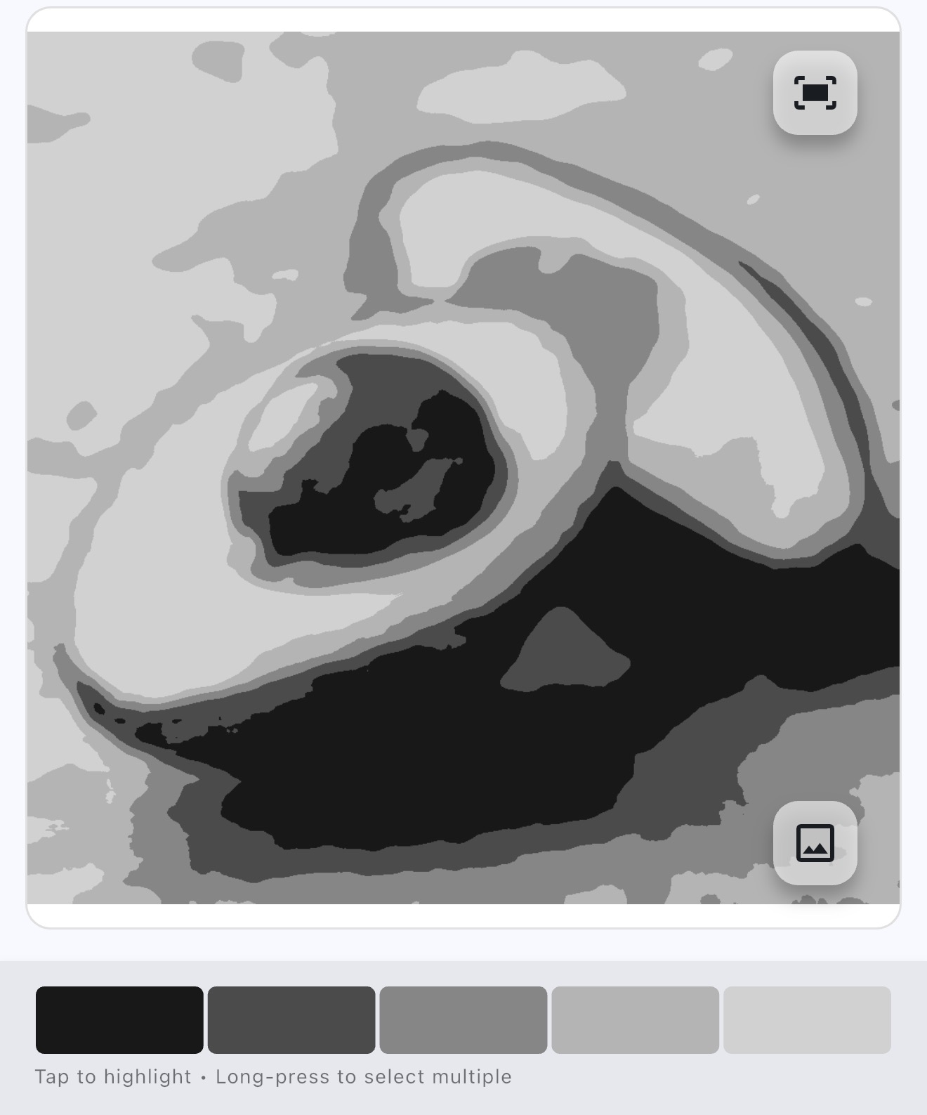
Checking value structure, seeing light/dark patterns
Use when
Planning composition, troubleshooting a "flat" painting
Quick start
Go to Values → Set 3-5 values → Tap swatches to highlight areas
Value studies strip away color to show only lightness and darkness. Getting values right is often more important than getting colors right.
Controls
Values slider — Set how many value levels to use (fewer = simpler study).
Smoothing — Apply None, Subtle, or Strong pre-smoothing for cleaner value masses.
Brightness — Shift all values lighter or darker while preserving their relationships.
Show Hue — Tint each value region with its original hue while keeping your simplified value structure.
The Value tool uses Smart Grouping to find natural value boundaries based on your specific image, rather than just dividing the grayscale range into equal chunks. This preserves the relationships between light and shadow that make your reference work.
Exploring Values
Tap a value swatch at the top to highlight all areas with that value.
Long-press to select multiple values, tap again to deselect.
Hold the image button (bottom right) to temporarily show the original for comparison.
Tip: Start with just 3 values (light, mid, dark). If your painting works in 3 values, it will work with more detail. Weak value structure can't be fixed by adding more values.
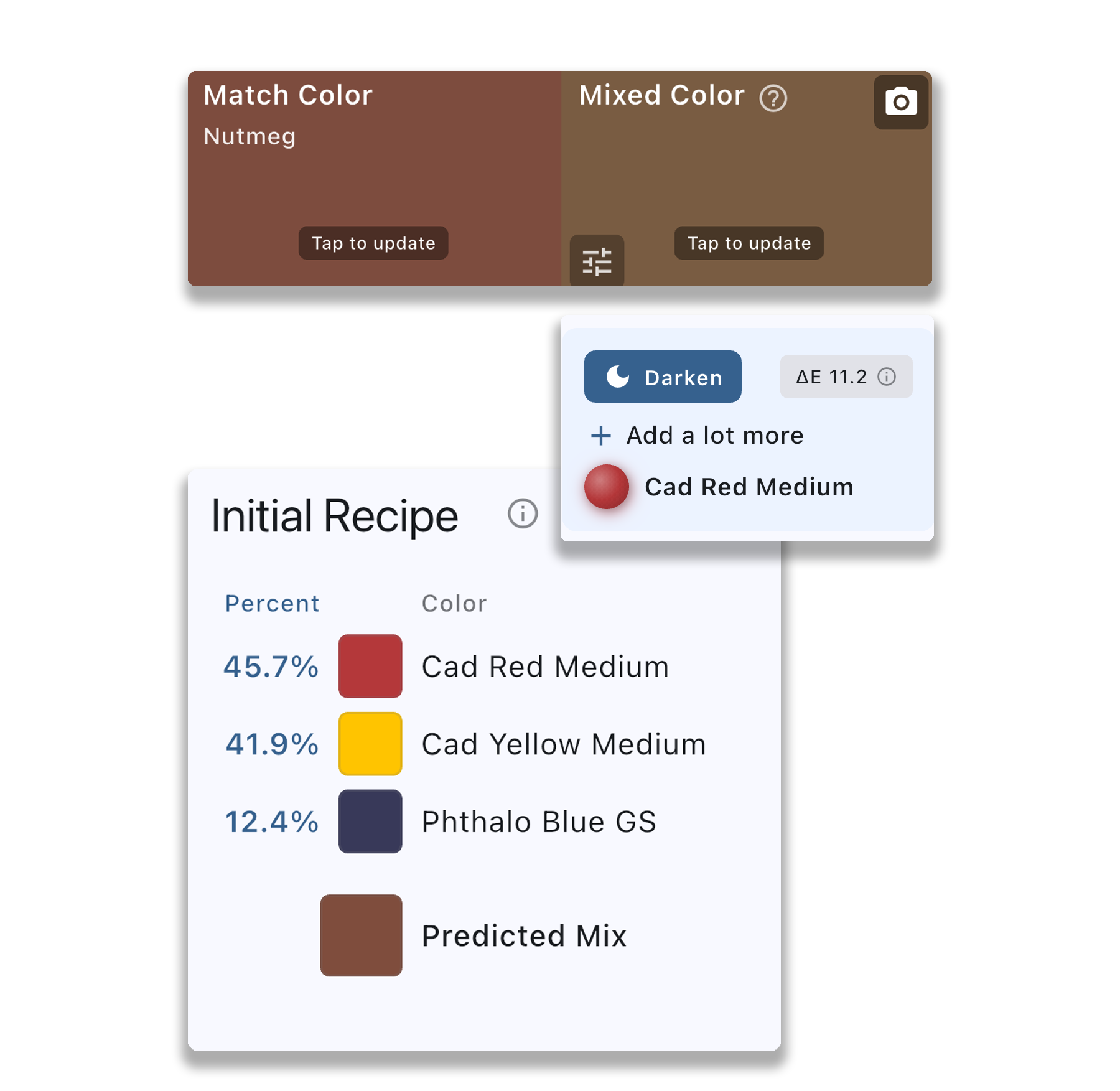
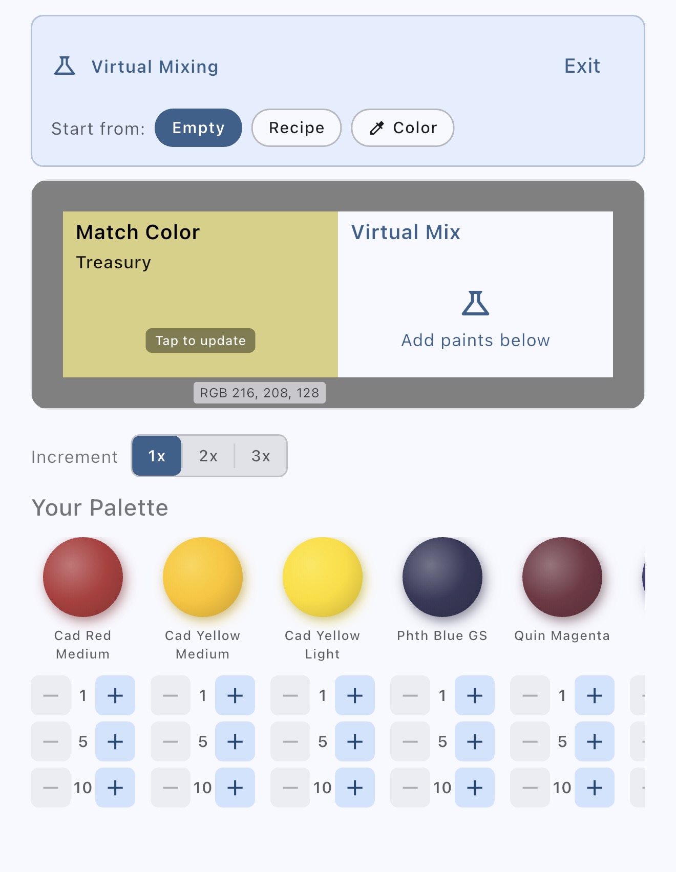
Pick color → Tap Mix → Follow recipe → Photo your mix → Adjust
Match colors accurately by getting real-time feedback on your physical paint mixes. Set a target, photograph your mix, and get specific guidance on how to adjust.
Enter from the color card — Tap Mix on any color to set it as your Match Color.
Tap to update the Match Color anytime from your palette or by picking from the image.
The Match Color is automatically adjusted to be mixable with the paints you have selected in your palette. Why? Digital images can display millions of colors, but physical paints have a limited gamut. Some colors on screen simply can't be mixed with real paint — the app finds the closest achievable color from your palette.
The Mixing Workflow
See your Initial Recipe — Based on your palette, the app shows a predicted mix to get you started.
Mix your paint using the suggested proportions.
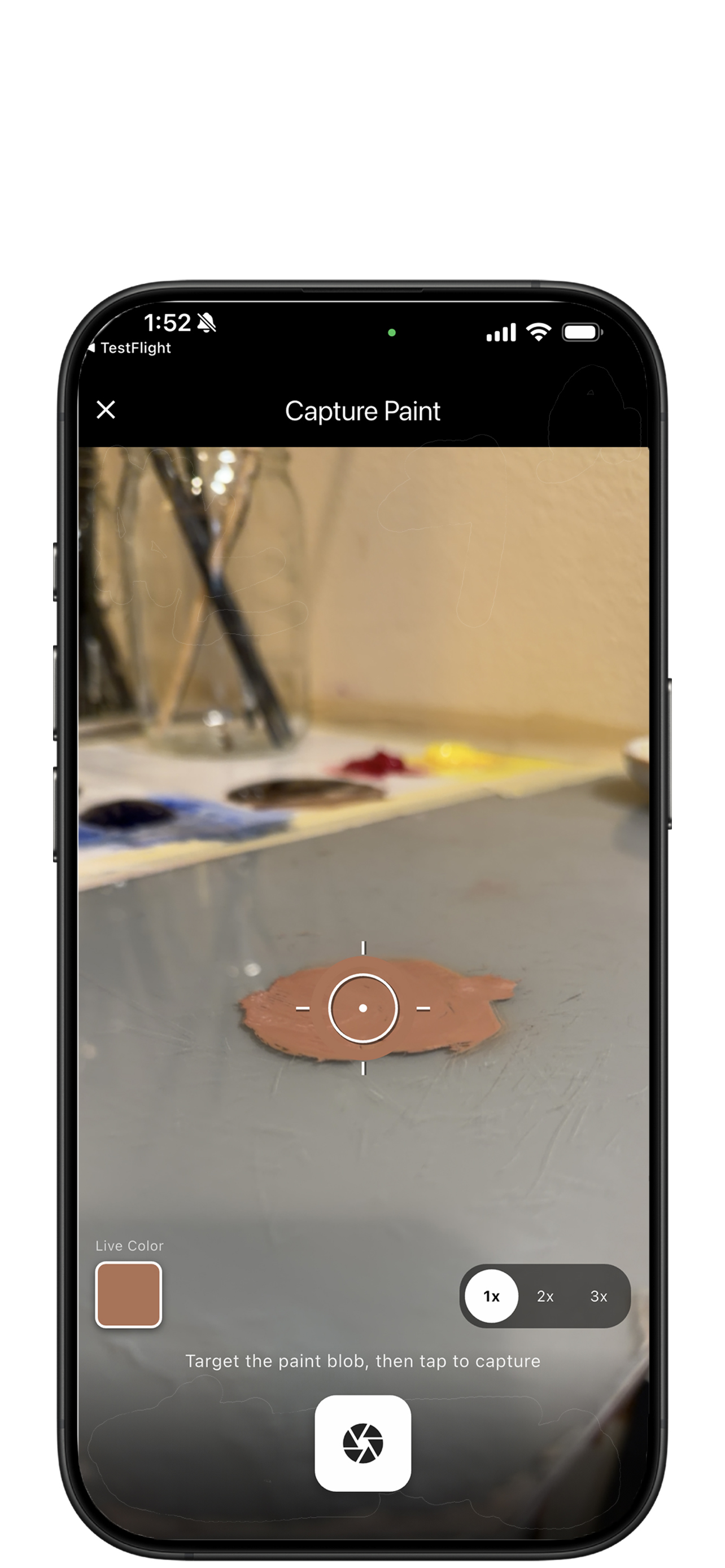
Photograph your mix — Tap the Mixed Color swatch to capture your actual paint with your device's camera.
Get adjustment guidance — The app compares your mix to the target and tells you what to add (e.g., "add white to lighten" or "add blue to cool it down").
Iterate — Adjust your paint, take another photo, and repeat until you hit the target.
Recipes show each paint with its proportion — either as a ratio (e.g., 3:1) or percentage (e.g., 75%/25%). Tap the numbers to toggle between the two formats.
Note: Paint mixing designed for opaque paints (oils, acrylics, gouache). Transparent media like watercolors mix differently and are not supported.
Setting up before a painting session, switching between paint sets
Quick start
Mix options → Manage Palettes → Add paints or load a preset
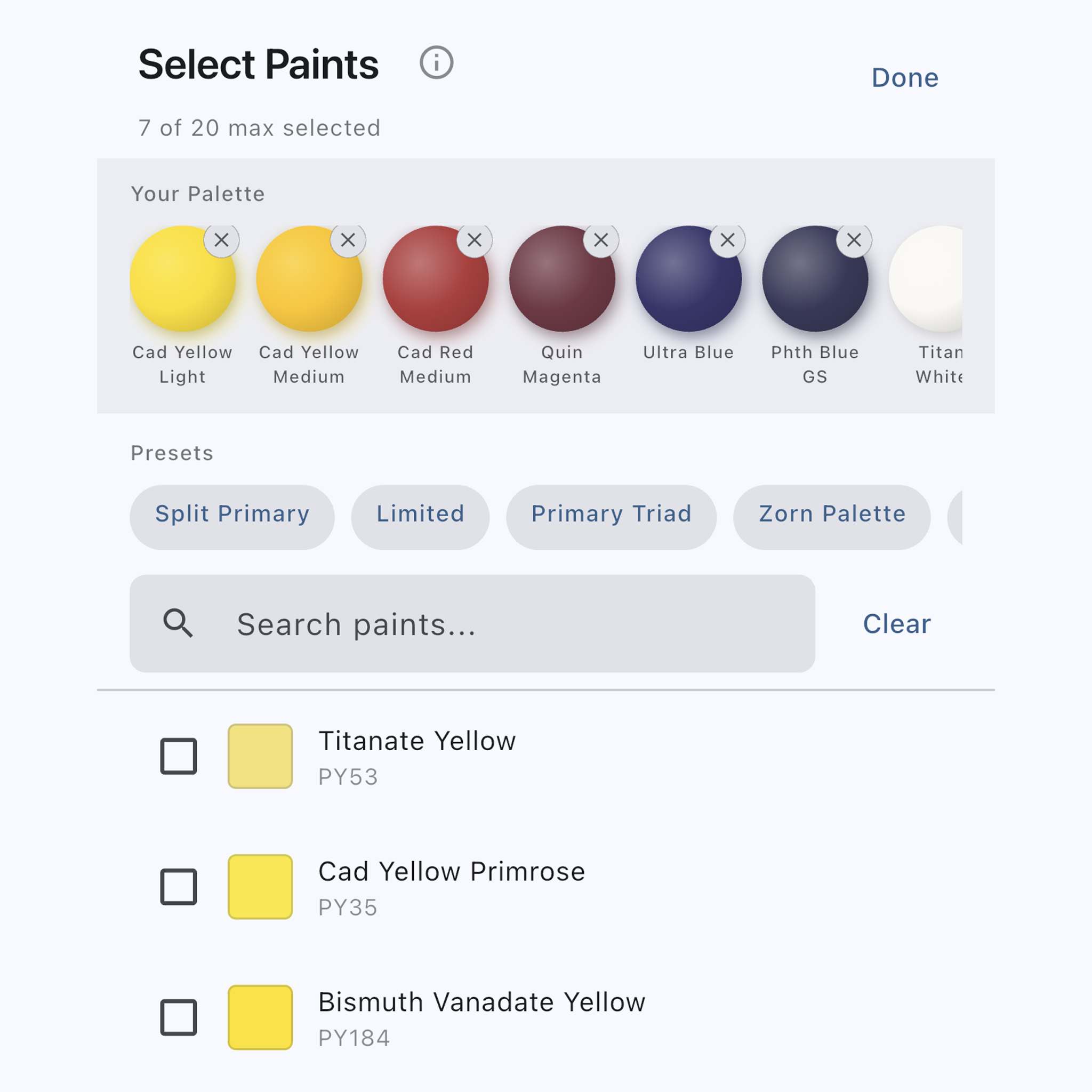
You can create multiple palettes — for example, one for a limited warm palette and another for a full split-primary setup. Open Manage Palettes from Mix options to add, organize, and switch between them.
New palette — Tap the + button in the palette tabs row. You can start empty or load a preset collection (Split Primary, Zorn, Limited, Primary Triad, and more).
Switch palettes — Tap a palette tab to select it. The selected palette becomes the active palette.
Rename — Long-press a palette tab and choose Rename.
Delete — Long-press a palette tab and choose Delete. At least one palette must exist.
Add paints — Search by paint name, alternate name, or pigment code (e.g., "PY42") to find paints, then tap a paint row to add it to your palette (up to 30 per palette). Tap again to remove it.
Paint swatches — Tap a paint swatch in the palette strip to scroll that paint into view in the list below. Tap the swatch again to reveal an X — tap the X to remove it from the palette.
Jump to color group — Use the arrow button to jump between color sections (Reds, Blues, Yellows, etc.) for quick browsing.
The active palette is the one used everywhere in the app — all recipes, mixing calculations, and Color Details exports use the paints from the active palette. When you switch palettes, recipes update automatically.
Paint Library
The paint library uses artist-quality paints for mixing predictions. In Manage Palettes, each paint in the list shows its pigment codes and an indicator for opacity — whether the paint is opaque, semi-opaque, semi-transparent, or transparent. Tap the info icon in Manage Palettes for a full legend.
Matching paints across brands — Paints with the same pigment code (e.g., PY42) are often good matches across brands. Search by name or pigment code to find the closest paint to what you have. Treat recipes as starting points, since exact color and mixing behavior can vary between brands and even batches.
Measured paints — Paints marked with the verified badge have been measured using additional spectral reflectance data for more accurate mixing predictions. We are continuing to measure additional paints — new ones will appear with the badge over time.
You want fewer paints in a recipe, or want to explore options
Quick start
Mix options → Set alternative recipes level → Swipe between recipes
In Mix options, set the alternative recipes level to see multiple recipe variations for the same color. The app generates simpler recipes that use fewer paints, trading a small amount of accuracy for easier mixing.
Three levels are available:
Best only — Shows just the single most accurate recipe for each color
Close — Includes alternatives within a small color difference (ΔE up to 5). These are close enough that the difference is subtle in most viewing conditions
Broader — Includes alternatives with a larger tolerance (ΔE up to 15). Useful when you want the simplest possible recipe and can accept a more visible difference
When alternatives are enabled, recipe cards appear that you can swipe between — from the most precise recipe to progressively simpler ones. The arrows and "Recipe 1 of N" label show your position. Each card shows the recipe, a color comparison swatch, and the ΔE (color accuracy).
The number of alternatives varies by color. Some colors can be mixed many ways; others have only one good recipe. If no alternatives fall within your chosen level, you'll see just the single best recipe with no navigation controls.
Experimenting with paint combinations without wasting paint
Use when
Planning mixes, exploring what colors you can make
Quick start
Mix options → Enter Virtual Mixing → Tap paints to combine
Use virtual mixing for "what-if" experiments — see predicted results of different paint combinations without wasting paint. Great for planning mixes before committing.
Creating references to use while painting — printed, laminated, or on a second screen
Use when
Ready to paint, want a reference with big color swatches to compare against
Quick start
Tap Export → Choose options → Save or share
Every view in Color Study can be exported. Some painters laminate their color map so they can hold paint swatches directly against the reference colors. Others prefer to keep the app open while painting to examine new colors as needed — either way works.
You want paint mixing recipes, color codes, or a printable color reference
Quick start
Normal View → Export → Color Details → Toggle options → Save
The Color Details export gives you a dedicated view of every picked color with full details. Access it from the Export menu in Normal View. You can toggle what information to include:
Color swatch and number for each picked color
Color name — creative or standard name for the color
Color code — in your preferred format (HEX, RGB, LAB, etc.)
Paint mixing recipe — shows which paints from your active palette to mix and in what proportions
Mixed color preview — the predicted result of the paint recipe next to the target color
Recipe format — toggle between percentage and ratio display
Choose between a list view or table view layout, and sort colors by number, lightness, or hue. Export as an image to save or share, or as a CSV file for use in spreadsheets or other tools.
If you have alternative recipes enabled in Paint Mixing settings (Close or Broader), rows in the Color Details export that have multiple recipe options show cycle arrows and a "1 of N" indicator next to the recipe so you can step through alternatives for just that color. You can also swipe a row left or right to cycle. Not every color will have alternatives — some colors have only one good recipe with your current palette, so those rows won't show navigation controls. The selected recipe index is shared with the Paint Mixing dialog, so stepping through recipes in either place keeps both views in sync.
You want the app to remember your setup between sessions
Quick start
Color Code Display
Choose which color code format is shown in color details, exports, and copy actions. Options include HEX, RGB, CMYK, HSL, HSV, LAB, XYZ, and XYY. Pick whichever format you use most — for digital work HEX or RGB is common, for print work CMYK, and for color mixing LAB can be useful since it closely matches how we perceive color differences.
Color Naming
Controls how colors are named throughout the app. Creative draws from a large database of unique, evocative color names (like "Dusty Rose" or "Ocean Twilight"). Standard uses straightforward descriptive names based on hue, saturation, and lightness (like "Dark Blue" or "Light Warm Gray"). Choose whichever feels more natural for your workflow.
Save Image Colors
When enabled, any colors you add to your palette are saved automatically. The next time you open the same image, your palette of color markers are restored — including their positions, colors, and numbering. This is useful when you return to a reference across multiple painting sessions and want to pick up where you left off without re-picking all your colors.
This is enabled by default. When disabled, your palette is cleared each time you close and reopen an image.
Per-Image Display
When enabled, display settings are saved individually for each image. This includes marker visibility and size, swatch size, connection lines, distributed swatches, and grid configuration. The next time you open the same image, it will look exactly as it did when you last worked with it.
This is helpful when you work with multiple references that need different setups — for example, a large landscape where you want small markers and no grid, and a portrait study where you want a grid overlay and large swatches. Each image remembers its own configuration independently.
When disabled (the default), every image opens with your current global display settings.
Restore Session
When enabled, your last sesion is restored including the last image that was open and any colors you had added to your palette.
 Using Color Study